Although the below graphs are generated for the same time frame and AWS RDS service in AWS Cost Explorer, why does the daily cost of the service seem to vary over time?
There are numerous reasons why these graphs appear different when viewed separately. As an example:
On the first day of every month, an extra workload may increase I/O consumption, leading to a rise in the overall cost of the AWS RDS service.
Conversely, the opposite may happen in the second graph.
Additionally, the RDS backup frequency could be set to once a month, but this may not be advisable for critical workloads or data in production, which is a topic for another discussion.
Yet there is another reason why they may appear different... So what could be the other reason?
The answer lies:
In the type of cost dataset (unblended or amortized) selected for analysis and visualization.
And the usage of a savings plan or reserved resources.
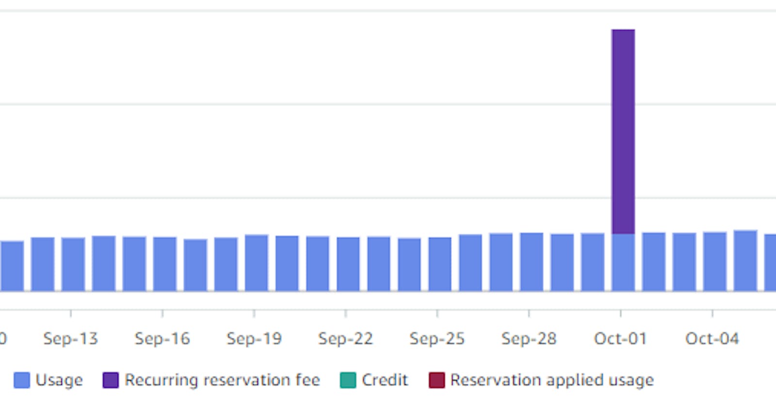
In the example provided, the first graph shows the unblended cost of the RDS service, while the second one displays the amortized costs. However, the service in question is subjected to a savings or reservation plan, which explains the discrepancy in the two visualizations based on different cost datasets. By default, AWS Cost Explorer presents the unblended cost of a service.
To obtain a clearer picture, it is crucial to use proper filtering in the Cost Explorer and group costs by dimensions, which will help in debugging cloud costs. The following two graphs depict the same data with proper grouping, which offers a much more accurate representation than the previous ones. It is vital to be aware of all the available filters and dimensions to optimize cloud costs effectively.
After applying proper filtering and grouping by charge type, the first graph above titled "Unblended Cost - Group By Charge Type" now displays the recurring reservation fee that is charged on the first day of each month. On the other hand, the second graph titled "Amortized Cost - Group By Charge Type" depicts the same cost spread evenly across the billing period. Also, these graphs reveals an enterprise discount applied that was not visible in the previous graphs.
So what is Unblended and Amortized Costs?
Unblended costs - are your usage costs on the day they are charged to you. These costs are calculated on a cash basis and are most likely the only cost dataset you'll need. However, for finance purposes, you might prefer amortized costs. Especially if you have a savings plan or reserved resources.
Amortized costs - refer to the total cost of a particular AWS resource or service, spread out evenly over the entire period, including any upfront or recurring fees for Savings Plans or Reservations. Amortizing your costs allows you to view them in accrual-based accounting rather than cash-based accounting.
Savings Plans and Reservations include charges that are either paid upfront or on a monthly basis. The monthly charges, which are illustrated in the preceding chart, are invoiced on the first day of each month. When unblended costs are used as the cost data set, this can cause an increase in cost on the first day of the month. However, if you switch to amortized costs, these recurring fees are distributed evenly throughout the month.
Examining your amortized expenses becomes essential when it's impractical to inspect your expenses on the day they were incurred. If you've procured Savings Plans or Reservations, then amortized expenses are likely the appropriate data set to assess your cost patterns. If not, unblended costs should be adequate for your needs.
Below are all four graphs side by side so you can see the difference between Unblended and Amortized cost with and without Charge Type dimension.
If the unblended and amortized cost charts for the AWS service appear identical, it's probable that the cost fluctuations aren't caused by a savings plan or reserved resources. In such a scenario, utilizing the group by feature to categorize service costs by various dimensions is the next logical course of action before seeking assistance from others.
------------------------------------------------------------------------------------
Thanks for reading!
If you enjoyed this article feel free to share on social media 🙂
Say Hello on: Linkedin | Twitter | Polywork
Github repo: hseera


