Performance engineers, after application architects, are usually the next persons to know about the overall application architecture and how everything fits together and interacts. In some cases, they are often the only ones who have a greater understanding of the architecture.
A colleague recently contacted me and asked for a high-level application architecture walk-through. He wanted to learn about the architecture so he could troubleshoot a performance issue. The application was designed using third party application and different AWS services.
Along with explaining the architecture, I was also creating response time scatter plots from various components during the walk-through to aid him in his investigation. I was not only educating him, but also assisting him in narrowing down potential areas of investigation.
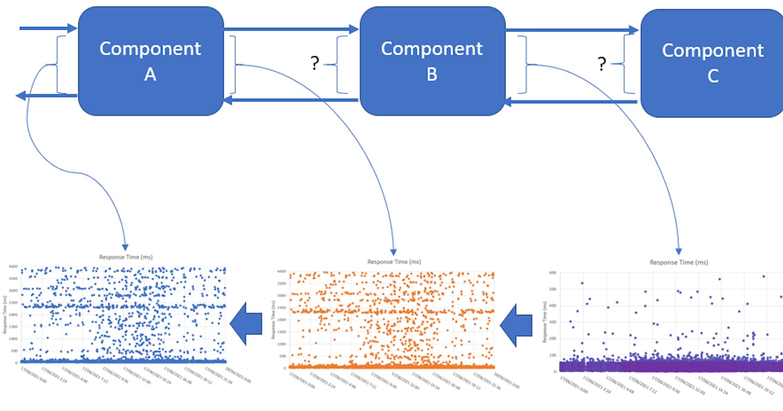
The architecture was complicated, and it necessitated a thorough examination of various system data. I realized I needed to use a different, more straightforward approach to assist him understand the architecture and make sense of the data. As a result, I devised a concept called the Scatter Flow Diagram (shown below).

Scatter Flow Diagram is a diagram that combines high-level application architecture and scatter plot. It uses scatter plots for each component to visualize entrance and egress response time. It maps each component's response time to the application architecture. It depicts the flow of response time between components (from right to left) and how it varies.
I found the following benefits of using the Scatter Flow Diagram:
- We could see which components are prospective areas for his investigation based on their visual response time. This also assisted him in enlisting the assistance of the appropriate individuals in order to troubleshoot and resolve the issue (highlighted below).

The response time on the left graph varies from 0 to 4000ms. The response time on the rightmost graph varies from 0 to 600 milliseconds. In addition, the graphs on the left exhibit a bigger response time variance than the other two on the right. The left most graphs are exhibiting three different type of response time patterns compared to the other two on the right.
- He may quickly share this graphic with other team members (internal or external) and make the observation visible. The data that backed up his claim was displayed in a diagram. Teams didn't had to run several queries or look at separate dashboards to extract and visualise data.
- The high-level design of how their own component connects with other components could likewise be seen by different service teams. They might only be responsible for one or more services that make up the application architecture. This approach gives them an overview of the architecture and appreciate the complexity involved in identifying and fixing performance issues.
- We were able to easily overlay and visualise how response time varied across each component.
- It also revealed regions where there was a lack of observability. The question marks in the diagram above indicate that there is a lack of observability.
This method can be applied to response code or error rate across different components.
Thanks for reading!
If you enjoyed this article feel free to share on social media 🙂
Say Hello on: Linkedin | Twitter | Polywork
Github: hseera
