

Response time is crucial to understanding system behavior. It is also one of the metrics commonly reported by performance test tools. Yet common presentations of this metric can hide important details and patterns, just like the graph below.

It is critical that you have raw data for further analysis, as and when needed. It is also important that you select the right chart to represent the raw data. Use chart(s) that will help highlight patterns missed by basic representation (i.e. average response time graph).
In my experience, the most common choice of chart to display individual data points is the scatter plot. Below is an example of using the scatter plot to display the individual response times for a test run.

The scatter plot is good for displaying individual data. However, there are times when displaying a large amount of data using the scatter plot can overwhelm your visual senses. Just like the chart above. There is too much information to dissect from it. Because of the sheer amount of data, some patterns are not visible.
In this post, I want to introduce you to another alternative to the scatter plot and that is the heat map. The heat map can still highlight similar outliers, distribution modes, and other details without plotting every individual data.
Heat map buckets data that fall into the same range and then use colors to highlight the intensity/volume of data in each bucket.
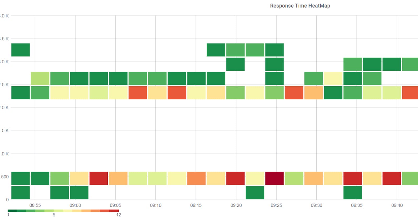
Below is an example from a test run where the heat map was used instead of the scatter plot. The first graph is the common way of representing the transaction response time (average response time graph). The second is the heat map showing the response time distribution and patterns not captured by the first graph. It was still able to highlight similar patterns that scatter plot would have but with fewer data points.

In above example, the more the number of data points fall in the same response time bucket, the darker the shade of red. And if the count is less than it is represented by a shade of green.
Another example where the heat map was used to complement the common response time graph. It shows a different pattern that is not visible in the primary graph. Again scatter plot would have done the trick but there would have been too much information on the chart. Using the heat map helped reduced the noise without compromising the data integrity.

Just like all other types of charts, using the heat map to represent response time data has its drawback too. There is no easy way to represent multiple transactions in the same heat map which is possible in the scatter plot.
Take away points from this post are:
- For a single transaction response time, use heat map to visualize individual data point over scatter plot.
- Make sure you select the right chart to display the data without overwhelming the visual senses.
- Most common way of presenting the response time data may hide patterns and details which are only visible when you use different way to present it.
In case you are wondering which tool I am using, it is the heat map plugin for Grafana.
Thanks for reading!
If you enjoyed this article feel free to share on social media 🙂
Say Hello on: Linkedin | Twitter | Polywork
Github: hseera