With the rise of dockerized environments and microservices, I find myself regularly using Wireshark to analyze network packets for performance-related issues. And one of the functionality I often use is the conversation view.
The conversation view is a nice way of getting packet summary between different endpoints. Below is an example of it. To keep the anonymity, the full IP addresses are not disclosed.

The conversation view in Wireshark has all the information you need about the network conversation. As you can see, if there are too many conversations (tcp) captured, it can become a little hard to keep track of them all. Even if you switch to IPv4 view, there are 37 different conversations.
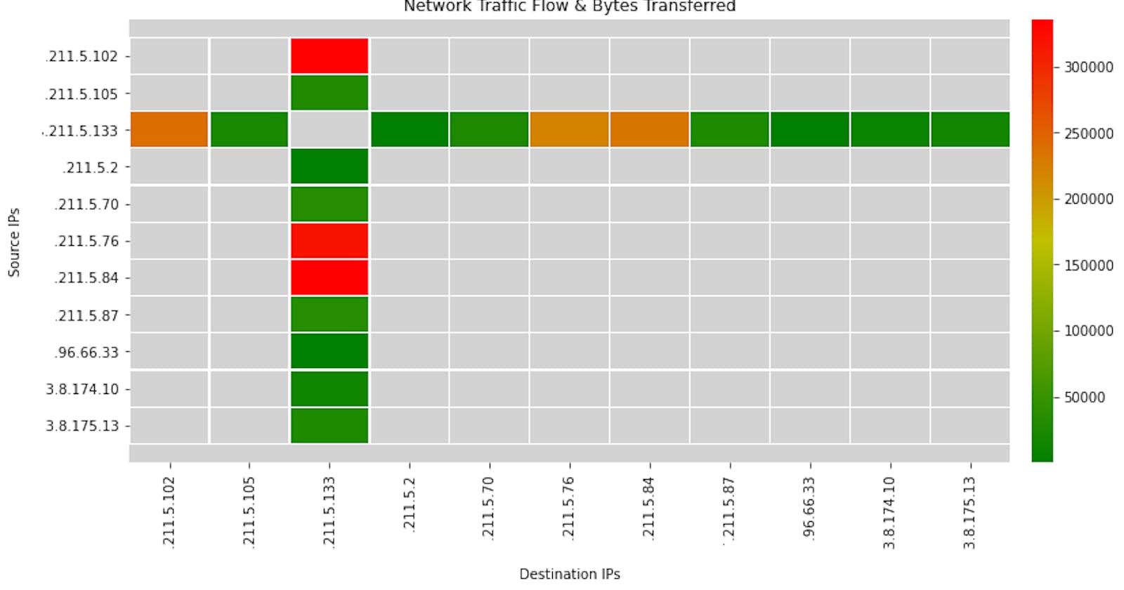
At times, you just want a simple high-level view of all the conversations. Something that will visually shows you the packet flow, total bytes transferred and any anomaly. Plus something simple that can be shared with others without them needing to install Wireshark or a similar tool. And that brings us to the Network Conversation Heatmap.
The Network Conversation heatmap is a python utility that takes the network trace (pcap/pcapng) and generates a network conversation heatmap. The benefits of the heatmap are:
- Visually highlights all the IP addresses captured in the trace file.
- Shows you the total number of sources and destinations and any relationship between them.
- Highlights the highest bandwidth-consuming conversations. Red signifies a high amount of data transferred between the endpoints, while Green means a less.
- The total amount of data transfer between the endpoints is also shown. The data is in Bytes.
- Easy to share the conversation with others to support your findings. Plus not everyone needs to have Wireshark installed to view it.
- You also get basic insights. Such as # of hosts on the same network communicating to a single destination, one-way communication (for example, workgroup announcement) and system where the trace was captured.
How to interpret the heatmap:
- The y-axis is the source. These are the systems/applications that are sending data to the destinations.
- The x-axis is the destination. These are the systems/applications receiving the data from the sources.
- The color (& legend) signifies total data transmitted between source and destination for the captured session.
- Intersection point of all the traffic is the system where the network trace file was captured from.
Below are some heatmap examples.


The script also provides an option to visualize data as a graph instead of heatmap too. However it is currently work in progress. If you are interested to help enhance the code, please reach out to me.

Note: Time to generate heatmap is dependent on the size of the pcap file.
Thanks for reading!
If you enjoyed this article feel free to share on social media 🙂
Say Hello on: Linkedin | Twitter | Polywork
Github: hseera
